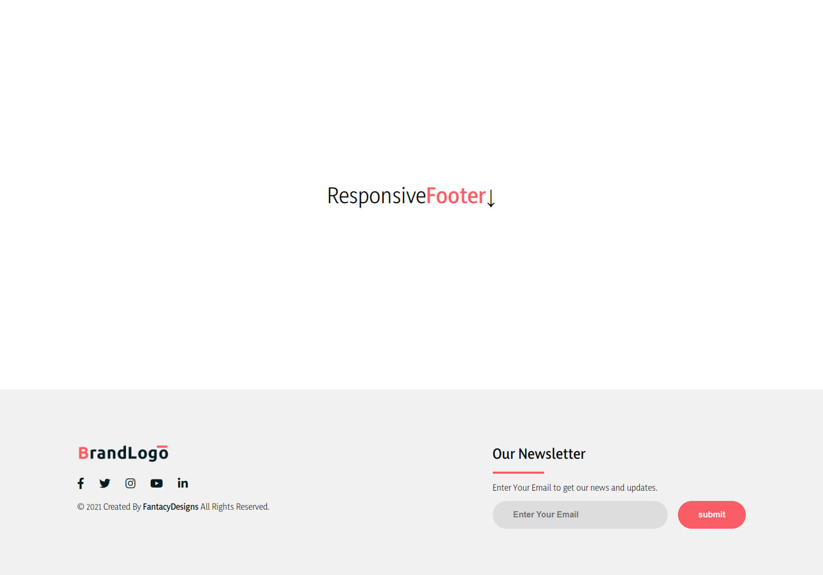
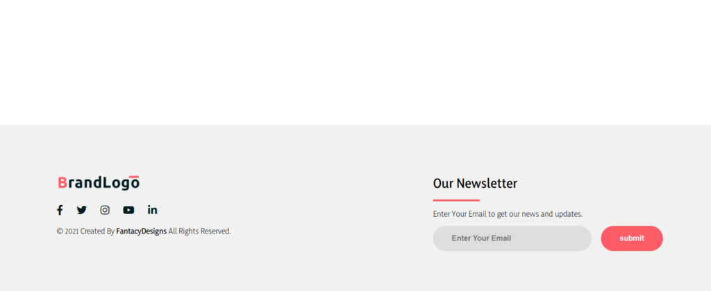
Footer is one of the most important components of the website and it is present at the bottom of the website. In the last post, we created a beautiful header and footer for the website. So, let’s build it.
A footer design in Html:
It is located at the bottom of the website. Footer is used for many purposes. It may contain links to different pages. So, that’s why it’s a very useful section of any website.
This footer is also created using Html and CSS only. It has four sections. Every section of this footer has different content of the footer. So, you can redirect to any section or page using these links.

This logo represented a website or company. Then on the right side of the footer, it has the heading “Social media links”. Below this heading, it has different links to different social media accounts like Facebook, Instagram, Twitter, etc.
Below this, it has a line, and then it has a text “@Copyright………..”. It is very simple to create this type of footer and we are gonna create it using Html and CSS. So, let’s start it.
You might like it:
How to create a responsive Footer design in Html?
For the development of the footer, we will be using the below steps. By using these steps, anyone can create this type of footer template design for the website.
Download an IDE/code editor:
The code editor is a basic need. It has multiple advantages in coding. So, download a relevant code editor for web base coding languages.
Source code of Html:
Html is a markup language used for creating web pages and the footer is the part of the web section. So, we are creating it using this language and it will help us to create the skeleton of the footer. Its code is written below. In IDE first, create a file with an extension of .html and then save the file
|
1 2 3 4 5 6 7 8 9 10 11 12 13 14 15 16 17 18 19 20 21 22 23 24 25 26 27 28 29 30 31 32 33 34 35 36 37 38 39 40 41 42 43 |
<!DOCTYPE html> <html lang="en" dir="ltr"> <head> <meta charset="utf-8"> <meta name="viewport" content="width=device-width,initial-scale=1"> <title></title> <link rel="stylesheet" href="style.css"> <link rel="stylesheet" href="https://cdnjs.cloudflare.com/ajax/libs/font-awesome/5.11.2/css/all.css"> </head> <body> <div class="page-content"> Responsive <span> Footer</span>↓ </span> </div> <footer> <div class="footer-container"> <div class="left-col"> <img src="logo.png" alt="" class="logo"> <div class="social-media"> <a href="#"><i class="fab fa-facebook-f"></i></a> <a href="#"><i class="fab fa-twitter"></i></a> <a href="#"><i class="fab fa-instagram"></i></a> <a href="#"><i class="fab fa-youtube"></i></a> <a href="#"><i class="fab fa-linkedin-in"></i></a> </div> <p class="rights-text">© 2021 Created By <b>FantacyDesigns</b> All Rights Reserved.</p> </div> <div class="right-col"> <h1>Our Newsletter</h1> <div class="border"></div> <p>Enter Your Email to get our news and updates.</p> <form action="" class="newsletter-form"> <input type="text" class="txtb" placeholder="Enter Your Email"> <input type="submit" class="btn" value="submit"> </form> </div> </div> </footer> </body> </html> |
Source code of CSS:
CSS is also a markup language and it is used for designing web pages. First, create a file of CSS with the extension of .css, and this copy-paste this code into your file.
|
1 2 3 4 5 6 7 8 9 10 11 12 13 14 15 16 17 18 19 20 21 22 23 24 25 26 27 28 29 30 31 32 33 34 35 36 37 38 39 40 41 42 43 44 45 46 47 48 49 50 51 52 53 54 55 56 57 58 59 60 61 62 63 64 65 66 67 68 69 70 71 72 73 74 75 76 77 78 79 80 81 82 83 84 85 86 87 88 89 90 91 92 93 94 95 96 97 98 99 100 101 102 103 104 105 106 107 108 109 110 111 112 113 114 115 116 117 118 119 120 121 122 123 124 125 126 |
@import url('https://fonts.googleapis.com/css2?family=Yaldevi:wght@400;600&display=swap'); body{ margin: 0; padding: 0; font-family: 'Yaldevi', sans-serif; } span{ color: #fc5c65; font-weight:900; } footer{ background: #f1f1f1; padding: 90px 0; } .footer-container{ max-width: 1300px; margin: auto; padding: 0 20px; display: flex; justify-content: space-between; align-items: center; flex-wrap: wrap-reverse; } .logo{ width: 180px; } .social-media{ margin: 20px 0; } .social-media a{ color: #001a21; margin-right: 25px; font-size: 22px; text-decoration: none; transition: .3s linear; } .social-media a:hover{ color: #fc5c65; } .right-col h1{ font-size: 26px; } .border{ width: 100px; height: 4px; background: #fc5c65; } .newsletter-form{ display: flex; justify-content: center; align-items: center; flex-wrap: wrap; } .txtb{ flex: 1; padding: 18px 40px; font-size: 16px; color: #293043; background: #ddd; border: none; font-weight: 700; outline: none; border-radius: 30px; min-width: 260px; } .btn{ padding: 18px 40px; font-size: 16px; color: #f1f1f1; background: #fc5c65; border: none; font-weight: 700; outline: none; border-radius: 30px; margin-left: 20px; cursor: pointer; transition: opacity .3s linear; } .btn:hover{ opacity: .7; } .page-content{ min-height: 100vh; font-size: 40px; display: flex; align-items: center; justify-content: center; } @media screen and (max-width:960px) { .footer-container{ max-width: 600px; } .right-col{ width: 100%; margin-bottom: 60px; } .left-col{ width: 100%; text-align: center; } } @media screen and (max-width:700px){ .btn{ margin: 0; width: 100%; margin-top: 20px; } } |
Your footer will be opened in your browser in front of you. If you are facing any error in creating the footer then download the source code from the below button. This file has all the code files and you will get this responsive footer.
Task:
This footer has the icons of social media platforms. The email subscribes button, logo, button, heading, and text as well. Now add the details of location, phone, and email as well. Also, present them along with icons.
Tip: Fontawesome for importing icons
If you have any type of query then don’t forget to ask.
Thanks for reading this article.
Download Source CodeClick to Download


